Effective Product Pages: 10 Elements That Drive Sales
9 min read · AstraLoop Studio
The product page is the one page on your e-commerce site where the visitor makes a binary decision: add to cart or close the tab. You can spend thousands of euros on advertising to bring in qualified traffic, but if the product detail page (PDP) doesn't convince, that budget turns straight into bounce rate. This isn't a cosmetic detail, it's the exact point where performance marketing meets the moment of truth.
The problem is that most product pages get filled in, not designed. Generic title, description copied from the supplier, two badly shot photos, zero social proof. They work just well enough to not look broken, but they leave a huge slice of conversions on the table. In this article we go through the 10 elements that genuinely move the needle, from the perspective of someone managing them not across three products but across an entire catalog.
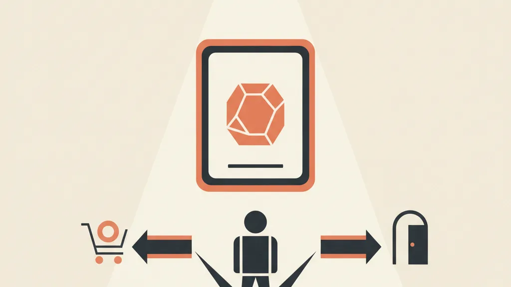
Why the product page is the conversion bottleneck
Picture the journey: a Meta or Google ad, a click, landing on the product page. All the work done upstream (targeting, creative, offer) converges right here. If the PDP's conversion rate is low, every euro spent before it returns less. Raise the page's conversion rate by 1 absolute percentage point on an e-commerce site doing 100,000 sessions a month with a 50-euro average order value, and you're talking about tens of thousands of euros a year. No campaign optimization hands you that multiplier as easily.
The reason it pays to start here is simple. The product page is an asset you optimize once and it keeps paying off across all traffic, organic and paid. It's the right place to focus your conversion rate improvement efforts before you even touch your campaigns.
The 10 elements of an effective product page
1. A clear, optimized product title
The title must state unambiguously what you're selling and include the terms users actually search for. Not "Model X-2000 Pro", but "Cordless Vacuum X-2000 Pro, 60-Minute Runtime". The formula that works is simple: product name, distinctive attribute, key benefit. It serves both the user, who instantly understands whether it's the right product, and SEO, since the title remains one of the heaviest-weighted signals Google uses for a product's organic visibility.
2. Images that sell, not just fill space
Images do most of the persuasion work on a product page, because online the customer can't touch anything. The minimum kit is:
- Product on a neutral background, high resolution, with working zoom
- In-context photos (the product in use, worn, in a real setting)
- Detail shots of materials, stitching, finishes, connectors
- Scale reference (the product next to a recognizable object)
- At least one image with text summarizing the 3 main benefits
Below 5-6 images per product, conversion drops noticeably. And the first image, the one that shows up in results and ads, is the one worth investing the most in: it's your first hook.
3. A description that speaks to benefits, not just specs
The most common mistake is a purely technical description: "2500 mAh battery". The customer isn't buying mAh, they're buying "60 minutes of cleaning without running back to the outlet". The structure that converts leads with the benefit (what changes in the customer's life), then the spec that proves it. Apply the principles of persuasive copywriting: translate every feature into a concrete, measurable advantage.
A structure that holds up well: an opening paragraph that names the problem the product solves, a list of benefits (feature translated into advantage), and a close that handles the main objection (durability, warranty, returns). Frameworks like PAS and BAB work well even on a block as short as a product description.
4. Visible, credible social proof
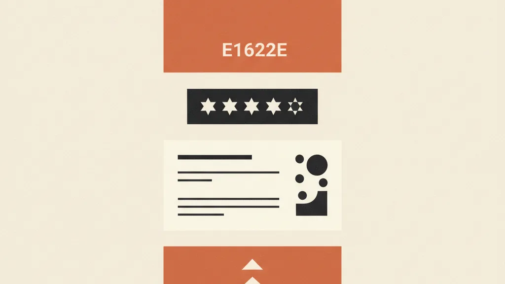
Reviews are the single element that moves conversion the most after images. Having them isn't enough: they need to be visible above the fold, with review count and star rating right next to the title. Reviews with customer photos are worth double, because they add authenticity. If the product is new and has no reviews yet, use other trust signals: "1,200 units sold", warranty logos, free-returns badges. Building a structured review-collection strategy remains one of the highest-return investments an e-commerce business can make.
5. Price and perceived value, handled well
Price isn't just a number, it's how you present it. A struck-through price with a visible discount, per-unit pricing when it makes sense ("€2.50 per capsule"), and total clarity on what's included. In Italy, use the correct format: 39,99, not 39.99. If the price is high, anchor it to a higher reference value or break it into installments ("from €15/month"). Bundle strategies and upsell and cross-sell techniques on the page raise average order value without bringing in a single extra customer.
6. An unambiguous call to action
One primary button, a color that stands out from the rest of the page, action-oriented copy ("Add to Cart" or, better still, "Add to Cart, Free Shipping"). It must stay visible at all times: on mobile, where most purchases happen, keep it fixed at the bottom as the user scrolls. Every second of hesitation spent looking for the button is lost conversion.
7. Urgency and scarcity, but honest
The urgency lever works, as long as it's real. "Only 4 left in stock" when you genuinely have 4, "Offer valid until Sunday" with a real countdown. Fake scarcity gets called out by savvy customers and burns trust. Used properly, it nudges someone who's already convinced to decide now instead of putting it off (and never coming back). Pair it with real activity signals ("12 people are looking at this right now") only if the data is genuine.
8. Shipping and returns information, up front
Surprise shipping costs at checkout are the number one cause of cart abandonment. Front-load everything on the page: delivery times, cost (or "free over €X"), return policy. An easy, clearly stated return policy lowers perceived risk and unlocks impulse purchases. If you have a high rate of abandoned carts, the cause is often a piece of information missing right here.
9. FAQs that pre-empt objections
Every product generates recurring questions: "is it machine washable?", "is it compatible with...?", "how long does the battery last?". An FAQ section on the page intercepts these questions before they become a reason not to buy (or a ticket to customer support). Well-written FAQs also capture long-tail Google searches, bringing you passive qualified organic traffic.
10. Speed and mobile optimization
The most beautiful product page in the world won't convert if it takes 5 seconds to load or if the button falls off-screen on a smartphone. Well-compressed images, mobile-first layout, tap targets big enough to hit. Always check the page from your phone, not just desktop: that's where most of your customers buy.
Do you have a large catalog and product pages that need rewriting one by one? Tell us how many products you manage: we'll work out together how to generate and personalize them at scale with AI, without losing quality or brand voice.
The real problem: optimizing pages across an entire catalog
Applying these 10 points to one product page is doable in an afternoon. Applying them to 500, 2,000, or 10,000 products is a different story. And that's exactly where most e-commerce businesses give up: the handful of showcase pages are polished, and everything else gets filled in automatically or with the supplier's description pasted verbatim, often identical to twenty competitors' (with all the SEO damage that implies).
The bottleneck isn't knowing what to write, it's scale. A human copywriter writing benefit-oriented descriptions, optimized titles and FAQs for thousands of SKUs costs a fortune and takes weeks. And this is exactly where AI changes the rules of the game.
AI-driven generation and personalization of product pages
With an AI-based generation system, trained on your brand voice, you can produce full product pages across your entire catalog while keeping quality and consistency intact. In practice this means:
- Optimized titles generated from the name, attribute, benefit formula, consistent across the whole catalog
- Benefit-oriented descriptions built from the supplier's technical specs, rewritten in your brand voice instead of copied
- Automatic FAQs built from the questions typical of each product category
- Image alt text and microcopy generated at scale, work no one does by hand but that matters for SEO and accessibility
The difference versus "dumping your data into ChatGPT" is the system: a model trained on your brand voice produces consistent, on-tone output instead of a thousand disconnected pages. If you want to understand how to set up the workflow, it's worth looking at how to use AI copywriting in a structured way rather than improvising.
The point isn't to replace strategic thinking (the 10 elements stay the same), it's to eliminate the manual work that stops you from applying them across the whole catalog. You decide the winning structure once, and the system replicates it across thousands of products with the right variation. It's the same principle that makes any e-commerce AI use case scalable: automating repetitive execution, not strategy.
How to prioritize your optimizations
Not every page deserves the same effort, and not every element has the same impact. A practical approach:
| Priority | What to work on | Why |
|---|---|---|
| High | Images and social proof on the top 20% of products (by traffic and revenue) | Maximum return per euro and hour invested |
| High | CTA, price, shipping info across all pages | Cross-cutting elements, fixable at the template level |
| Medium | Benefit-oriented descriptions (via AI) across the whole catalog | High SEO and conversion impact, only scalable with automation |
| Low | FAQs and microcopy on long-tail products | Useful but marginal per product, cumulative across the catalog |
The logic is the same as any data-driven approach to e-commerce KPIs: start where you already have traffic and volume, measure, then expand. Optimizing the page of a product that gets no visits will never give you the return of a micro-tweak on your bestseller.
Measure, don't guess
Every change should be validated with numbers, not gut feeling. Add-to-cart rate, page conversion rate, time on page, scroll depth. Whenever you can, run an A/B test: two versions of the same page (title, main image, button copy) and let the data decide. Small tweaks to CTA copy or image order can be worth several percentage points of conversion. Before redesigning everything, check what's already working and what isn't with clean event tracking, starting with Shopify tracking on GA4.
The perfect product page doesn't exist in the abstract: it's the one that converts for your audience, on your catalog, measured against your own data. The 10 elements are the starting point. The difference between an e-commerce business that applies them to three products and one that applies them to all of them, consistently and without losing its mind, today comes down to the ability to generate and personalize pages at scale with AI.
Frequently asked questions
How many elements does an effective product page need?
The fundamentals are 10: optimized title, quality images, benefit-oriented description, social proof, well-presented pricing, clear CTA, honest urgency, shipping and returns info, FAQs and mobile optimization. They don't all carry equal weight: images and reviews are the elements that move conversion the most.
How many images should a product page have?
At least 5-6 per product: the product on a neutral background with zoom, in-context usage photos, detail shots of materials and finishes, a size reference, and at least one image summarizing the main benefits. Below this threshold, conversion tends to drop noticeably.
Is a technical description better than a benefit-oriented one?
Benefits first, specs after. The customer isn't buying the battery's mAh, they're buying 60 minutes of runtime. The structure that converts translates every feature into a concrete advantage and uses the technical spec as proof, not as the main content.
How do I optimize product pages across a catalog of thousands of items?
Manually, it's impractical. An AI-based generation system trained on your brand voice produces optimized titles, benefit-oriented descriptions, FAQs and alt text across the whole catalog while keeping it consistent. You define the winning structure once, and the system replicates it on every product with the right variation.
Does urgency on product pages actually work?
Yes, if it's honest. Real counters, genuine availability ('only 4 left'), real deadlines push people who are already convinced to decide now. Fake scarcity gets called out by savvy customers and burns trust, backfiring completely.
How do I know if a change to the product page worked?
By measuring add-to-cart rate, page conversion rate, time on page and scroll depth before and after. When traffic allows it, an A/B test on the title, main image, or button copy tells you which version converts better without relying on gut feeling.
If you want to turn your e-commerce pages from filled-in to designed to convert, let's talk: we'll analyze your catalog and show you where the fastest growth opportunities are.