The Creative Mistakes That Kill Your Ad Performance
9 min read · AstraLoop Studio
Before you blame targeting, budget, or the algorithm, look at the creative. In the vast majority of ad accounts we get to see, the campaign underperforms not because Meta "doesn't work anymore," but because the ad makes two or three basic mistakes that kill performance in the first three seconds. Avoidable mistakes, every single one.
The uncomfortable truth of 2026 is that with Advantage+ and Andromeda automation, the algorithm already handles almost all of the distribution work. What's left in your hands is the creative. That's where a campaign is won or lost. This article is a diagnosis: the recurring mistakes we see most often, how to spot them, and what to change for each one.
This isn't a theoretical list. These are the patterns that repeat across UGC videos and static carousels alike, from B2C to ecommerce. If your last campaign has a below-average CTR and a rising cost per result, chances are at least three of these mistakes are in your creative right now.
Mistake 1: no hook (or a hook that arrives too late)
This is mistake number one, and on its own it explains more failures than all the others combined. The user decides whether to stop scrolling in about a second. If the first three seconds of the video (or the first glance at the static) don't give them a reason to stay, they've already scrolled past. No matter how polished the rest of the creative is, nobody will ever see it.
The symptoms are unmistakable in the data: low hook rate (few people make it past 3 seconds), a thumbstop ratio that's not worth keeping, views far lower than impressions. The typical causes: the ad opens with the logo, with a "corporate" intro, with three seconds of silence before getting to the point, or with the strongest claim buried at the end of the video when nobody's left listening.
The fix. Move the strongest moment to second zero. Open with the promise, the problem, a visual movement, or a direct question. No slow build-up: the peak has to be the very first frame. If you don't know where to start, look at some concrete examples of hooks for creatives and adapt them to your product instead of opening with the usual brand introduction.
Mistake 2: unreadable text
The second silent killer. The creative gets consumed on a six-inch screen, often on the move, almost always in a distracting environment. If the text is small, thin, low-contrast, or sitting on a busy background, it simply doesn't get read. And a message that isn't read is a message that doesn't exist.
The most common mistakes are always the same: font too small for mobile, white text on a light background (or black on dark), captions covering the product, too many words crammed into one frame. And then the classic of classics: the video talks, but without sound it makes no sense, while most people watch with the sound off.
- High contrast, always. Light text on a dark band, or vice versa. If in doubt, add a semi-transparent band behind the words.
- Few words, big. One idea per frame. If it needs a second read, it's already too long.
- Subtitles, always. A vertical video that only makes sense with sound on is already losing. Here's why subtitles are decisive in video ads and should be the default, not an afterthought.
Mistake 3: elements outside the safe zone
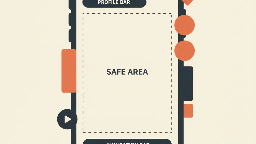
This is the sneakiest mistake, because the creative looks perfect while you're editing it. Then it goes live on Reels or Stories, and the profile bar at the top, the buttons on the right, and the call-to-action at the bottom eat into the edges. The result: the price gets cut off, the CTA is covered by the "Shop now" button, the claim is half hidden behind the profile icon.
Every placement has different obstructions. An ad designed for the square feed that ends up full-screen in Stories loses everything positioned too close to the top and bottom margins. It's a purely technical problem, which makes it even more absurd to let slide.
The fix. Keep every critical piece of information — text, logo, price, CTA — away from the edges, inside the safe central area. As a rule of thumb, leave breathing room at the top and bottom and never place anything important in the last few centimeters of the frame. Our guide to Meta's safe zones lists the obstructions by format: keep it open while you set up the composition, not afterward.
Mistake 4: confused message (too many ideas, no benefit)
A creative should communicate exactly one thing, in a way that whoever glances at it for one second immediately gets it. The recurring mistake is the opposite: feature after feature, three different offers, the logo, the tagline, the QR code, the promotion, and the guarantee, all crammed together. The user's brain has no time to decode that noise, so it moves on.
There's also a sneakier variant: the creative lists features instead of benefits. "5000 mAh battery" says nothing. "Two days of battery life on a single charge" does. The difference between describing the product and selling the result is often the entire difference between an ad that converts and one that doesn't.
The fix starts with one question: what's the one single thing this person needs to understand and remember? That's the creative. Everything else is distraction to cut. Build the message around the main benefit and a single call to action. If you have multiple valid angles, don't stack them: turn them into separate creatives to test. It's also worth revisiting your copy, because many ad copy mistakes come from exactly this — trying to say everything at once. A good place to start is learning how to write Facebook Ads copy that actually sells and applying it to the creative, not just the caption.
Mistake 5: zero variants (one single creative, no testing)
Even the best creative has an expiration date. The audience sees it, gets tired of it, stops reacting: that's creative fatigue, and it always arrives. Whoever launches a single creative and lets it run until the cost per result explodes is making a structural mistake, not an aesthetic one. Without variants there's no way to know which angle, which hook, or which format works best — and no replacement ready when the current one wears out.
The paradox is that in the age of automation, this mistake weighs more than ever. Meta's algorithm learns and optimizes only if you give it material to choose from. A single creative removes exactly the lever the whole system is built on. The right number depends on spend, but the logic doesn't change: you need more creatives per month to feed Meta, and you need to decide how many creatives to run per campaign based on budget, not guesswork.
The fix is a method, not a single brilliant idea. Produce variants that change one variable at a time (different hook, same body; same hook, different format), let them compete, and keep the ones that win. You need an orderly creative testing method, otherwise you're comparing apples to oranges and learning nothing. And above all, it needs to be measured: here's how to really tell if a creative is performing by looking at the right metrics instead of gut feeling.
Want to find out which of these mistakes are holding back your campaigns right now? Request a review of your creatives: we'll tell you exactly what to change, no fluff.
The quick diagnosis: a checklist before you publish
Before you launch any creative, run it through these checks. If even one comes back red, stop and fix it: it costs less to change a creative than to burn three days of budget on a limping ad.
| Check | Question to ask | If the answer is no |
|---|---|---|
| Hook | Is there a reason to stop scrolling in the first 3 seconds? | Move the peak to the start |
| Readability | Does the text read on mobile, without sound, at high contrast? | Enlarge it, boost contrast, add subtitles |
| Safe zone | Are price, CTA, and claim far from the edges? | Bring everything back into the safe central area |
| Message | Does it communicate one single idea, and is it a benefit? | Cut the noise, keep just one concept |
| Variants | Are there at least 3-4 versions to test? | Produce variants, change one variable at a time |
This isn't bureaucracy: it's the filter that separates a creative that's ready from one that's giving money away at auction. Apply it in thirty seconds and you'll avoid most failures before you've even spent a euro.
Why these mistakes matter more than ever in the Andromeda era
There's a reason 2026 is the worst year to get your creatives wrong. With Andromeda, Meta's new retrieval and ranking engine, the ad machine has gotten extremely good at showing the right ad to the right person. It has shifted almost all of the performance weight from targeting onto the creative. In practice: the algorithm no longer saves you from a weak ad, because its skill lies precisely in matching the creative to the audience, not in propping up the numbers of a poor one.
This flips the priorities. Until yesterday, teams spent days fine-tuning audiences and exclusions; today the system does that work. The competitive edge has shifted to whoever produces better creatives, more varied and faster than everyone else. If you want the full picture of this shift, we explained what changes with Andromeda and why the creative is the new audience.
The practical consequence is simple but uncomfortable: you need to produce more and get it wrong less, at the same time. And that's exactly the bottleneck where companies get stuck, because making lots of clean creatives by hand doesn't scale. This is where AI changes the rules: it lets you generate consistent variants across multiple formats in a fraction of the time, while keeping hook, safe zone, and message under control. If this is your limit, see how to produce ad creatives with AI at volume, without giving up on quality.
How to avoid them systematically
Fixing one creative at a time works, but it's not enough if the problem resurfaces with every campaign. The mistakes we've covered aren't random: they come from a missing process. Whoever produces creatives "by feel," without a checklist and without a testing method, will make them all again, every time.
The solution is to turn these checks into a repeatable process: a hook designed upfront, fixed rules on readability and safe zone, one message per creative, an ongoing cycle of variants. That's exactly the logic behind the whole cluster: if you want the full picture, start with our complete guide to ad creativity, which ties all these pieces together into a single system.
Creative mistakes don't kill performance because they're hard to avoid. They kill it because almost nobody checks for them before publishing. Put a filter between your creative and the auction, produce enough variants, and measure what works: on its own, that puts you ahead of most of the competitors who keep blaming the algorithm.
Frequently asked questions
What's the biggest mistake in an ad creative?
The absence of a hook in the first three seconds. The user decides whether to stop scrolling in about a second: if you don't give them a reason to stay right away, they've already scrolled past and nobody sees the rest of the creative. It's the mistake that on its own explains more failures than all the others.
How do I know if my creative has a hook problem?
Look at the hook rate and the thumbstop ratio: if few people make it past 3 seconds and views are much lower than impressions, the opening isn't holding attention. This usually happens when the ad starts with a logo, a corporate intro, or silence instead of the promise.
What are Meta's safe zones and why do they matter?
They're the areas of the format where the interface (profile bar, buttons, call-to-action) doesn't cover the creative. If you place price, CTA, or claim too close to the edges, they get cut off or hidden in Reels and Stories. Text and critical information need to stay within the safe central area.
How many creative variants does a campaign need?
It depends on spend, but a single creative is always a mistake: it wears out from fatigue and leaves the algorithm nothing to optimize with. The rule of thumb is at least 3-4 versions that each change one variable at a time, so you can tell what works and have a replacement ready.
Why is the text in my creatives unreadable?
Almost always because of low contrast, a font too small for mobile, or too many words in one frame. Creatives get viewed on small screens, on the move, and with the sound off: you need few, big words, high contrast, and subtitles by default on every video.
Does AI really help avoid these mistakes?
Yes, especially with volume. The bottleneck for many companies is producing enough clean variants without going crazy: AI generates consistent versions across multiple formats quickly, keeping hook, safe zone, and message under control. The method — checklist and testing — is still up to you.
If your real bottleneck is producing better creatives in sufficient numbers, let's talk: we'll show you how to combine AI and method to generate variants ready for the auction. Write to us at astraloopstudio@gmail.com.