How to Design Creative That Meta's Andromeda Algorithm Rewards
9 min read · AstraLoop Studio
For years, anyone running ads on Meta had one job above all: pick the right audience. Interests, lookalikes, retargeting. Creative mattered, sure, but the game was won on targeting. With Andromeda, the retrieval engine that now powers Advantage+, that logic has flipped. The machine no longer waits for you to tell it who to show the ad to: it reads the content of the creative and decides for itself who the right audience is.
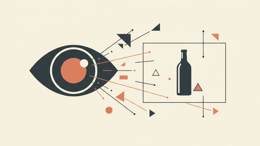
That changes how you design your visuals. It's no longer enough for a creative to look good or stop the scroll: it also has to be machine-readable. Andromeda uses computer vision to analyze the image (what's in frame, the colors, the composition, who's shown), semantic analysis to understand the text, and, for video, audio analysis. From all of this it builds a kind of digital fingerprint of the ad: a set of attributes describing what the creative is actually about. If that fingerprint is muddled, the machine can't tell what you're selling and won't find the right audience.
In this article we look at what it means to design for a machine that sees, which visual signals help Andromeda read a creative correctly, and we close with an operational checklist to run against your next batch of ads. If you want the bigger picture of what's changing with this engine first, start with what's really changing with Andromeda for creative.
What "machine-readable creative" actually means
The term sounds technical, but the concept is simple. A machine-readable creative is an ad a machine can interpret without ambiguity: it understands what the product is, who the implied target is, what tone it has, what problem it solves. We're not talking about code or hidden metadata. We're talking about signals that live inside the image and the visible copy, which today get read by a computer vision system.
Meta's technical documentation describes Andromeda as a retrieval engine with roughly 10,000 times the model complexity of the system it replaced, built to extract latent user-ad interaction signals on the fly. In practice, before it ever shows you an ad, the system has already computed an embedding — a numerical representation of the creative — and compares it against billions of behavioral signals to figure out who the ideal audience resembles.
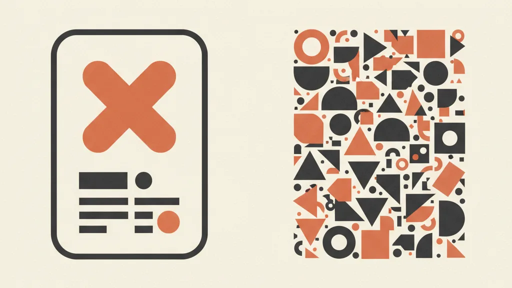
The consequence for anyone designing creative is direct. If the creative is clean and communicates one clear concept, the fingerprint that comes out of it is precise and the machine finds a coherent audience. If instead the creative is a crowded collage — three different products, four fonts, a background that has nothing to do with anything — the fingerprint is blurry: the system receives contradictory signals and distributes the ad less precisely. It's not a formal penalty, it's a comprehension problem.
The flip side: readable doesn't mean flat
Watch out for a common misunderstanding. Machine-readable doesn't mean generic, cookie-cutter creative. Quite the opposite. Andromeda groups ads into a tree structure based on semantic similarity: creatives that are too similar to each other (in visual, tone, format) end up in the same cluster and compete against one another instead of expanding reach. So you need to hold two goals at once. Every single creative has to be internally clear, but the creative set as a whole has to be externally diverse. Clarity inside, diversity outside.
The visual signals Andromeda reads (and how to design for them)
Let's look concretely at which design elements weigh on machine reading. This isn't theory — these are the same dimensions a computer vision system extracts from an image.
1. One main subject, recognizable at a glance
Computer vision identifies the objects in frame. If there's a dominant, in-focus subject, the system classifies it with confidence. If the frame is split between two unrelated products, or the product is tiny in a corner, classification becomes uncertain. Practical rule: one concept per creative. Want to test three products? Three separate creatives, not one creative with three products crammed in. The same goes for people: a clear, front-and-center face is a strong signal, which is one reason Andromeda tends to favor formats like testimonials, unboxings, and lifestyle integrations — they're rich in recognizable signals.
2. Legibility of on-screen text
Copy inside the image gets pulled out through text analysis (Meta uses text-recognition systems across billions of frames). For it to be read well, it has to actually be legible: high contrast between text and background, a clean font, adequate size, no words broken up by graphic elements overlapping them. White text on a light background isn't read well by the machine or by the user. And remember the safe zones for Meta placements: if your claim ends up under the Reels or Stories button, as far as the machine (and the viewer) is concerned, it isn't there.
3. Color consistency as a category signal
Dominant colors are among the first attributes computer vision extracts. A palette consistent with the product and its category helps place it correctly: warm, textured tones for food, clean and clinical palettes for functional skincare, bold contrasts for streetwear. This isn't about chasing a trend, it's about sending a coherent category signal. Random colors, chosen just because they pop, risk confusing the interpretation.
4. Composition that guides, not disorients
A clear visual hierarchy (subject first, then the claim, then any price or CTA) is legible to both the human eye and the system. Chaotic compositions, with ten elements fighting for attention, produce an ambiguous fingerprint. Simple creatives that convert aren't simple out of laziness: they're simple because simplicity is legible, and today legibility is a distribution factor.
5. Format and proportions matched to placement
Uploading a single square and letting Meta crop it for vertical placements is a mistake that degrades the signals. Automatic cropping cuts off heads, pushes the product off-center, hides the claim. Designing native variants (1:1 for Feed, 4:5 for mobile, 9:16 for Reels and Stories) keeps the subject centered and the signals intact across every placement. For guidance on choosing, see which Meta ad format to use.
Why set diversity matters as much as single-creative clarity
This is where a lot of people get it wrong. Making a creative legible is half the job. The other half is making sure your creatives don't all look alike, because Andromeda groups them by semantic similarity and, within the same cluster, tends to surface a few at the expense of the rest.
Changing only the headline on the same template doesn't produce diversity: to the machine, it's the same creative with different text. Real differentiation happens across several layers:
- Format: static image, carousel, UGC video, motion, split-screen.
- Angle: functional benefit, social proof, urgency, aspiration, curiosity.
- Environment: clean studio, real-world use context, outdoors, close-up detail.
- Production style: polished brand assets alternated with raw, native content (the founder talking, a talking-head clip, handheld footage).
Teams working with Andromeda tend to aim for a reasonable number of truly distinct concepts per campaign (roughly 8-12), with a few variants each, rather than twenty near-identical versions. We go deeper on sizing this volume in how many creatives you need per month on Meta. The logic is straightforward: more distinct concepts means more clusters covered, which means more audience slices reached.
For a business, this opens up a practical problem: producing enough distinct creatives at a sustainable pace. And that's where AI-driven creative production becomes a real ally — not to churn out clones, but to quickly generate variants in angle, environment, and format while keeping the product recognizable. We cover this in how to produce ad creative with AI.
Want to know if your creative is really speaking Andromeda's language? Ask us for an analysis of your current set and we'll show you where the signals get lost.
Operational checklist: is your creative ready for Andromeda?
Before uploading a batch, run every creative through these checks. If an item doesn't hold up, fix it: you're removing ambiguity for the machine.
| Check | Question to ask | Why it matters |
|---|---|---|
| Single subject | Is there just one dominant, in-focus product or concept? | Computer vision classifies a clear subject with more confidence |
| Legible text | Does the claim have high contrast and no words covered by graphics? | On-screen text gets extracted and weighted |
| Consistent palette | Are the dominant colors in line with the product and category? | Color is a top-level category signal |
| Clear hierarchy | Does the eye follow an ordered path (subject, claim, CTA)? | An ordered composition produces a clean fingerprint |
| Native format | Do 1:1, 4:5, and 9:16 variants exist without automatic cropping? | Automatic cropping degrades visual signals |
| Safe zones respected | Does the claim stay clear of areas covered by the interface? | Hidden text equals a lost signal |
| Diversity within the set | Is this creative truly different from the others, not just in the headline? | Similar creatives end up in the same cluster and compete |
| Captions on video | Is the speech captioned, and do the first seconds convey the concept? | The machine reads text and audio, and most people watch on mute |
One extra reminder for video: captions aren't an accessibility afterthought, they're textual content the system reads and that the viewer — almost always at zero volume — needs to see. And the concept needs to land right away, in the first few seconds, not saved for the end.
Measure, don't guess
Designing for the machine doesn't replace measurement — it makes it more reliable. With Andromeda deciding distribution based on the creative's signals, the only way to know which signals work is to test cleanly and read the right data. Don't stop at CTR: look at which concepts actually expand reach and drive conversions at a sustainable cost.
We have two useful deep-dives on this: how to tell if a creative is actually performing, beyond vanity metrics, and how to test creative on Meta in a way that makes results attributable. And avoid the classic slip-ups: many distribution problems start with creative mistakes that confuse the machine before they ever confuse the user.
In short
Andromeda has shifted the center of gravity from targeting to creative. The machine sees your ads: it identifies subjects, reads text, evaluates colors, interprets tone. Designing for this system means holding two things together. The first is making every single creative internally clear: one subject, a legible claim, a consistent palette, a clean hierarchy, native formats for every placement. The second is making the set externally diverse: genuinely distinct concepts across format, angle, environment, and style — not twenty copies of the same idea with a different headline.
Whoever trains both reflexes — clarity at the single-creative level, diversity at the set level — gives Andromeda precise fingerprints and material it can actually work with. And today, on Meta, it's the creative that does the targeting. For the full picture of what's changing and how to organize production upstream, go back to the pillar on Andromeda and creative and the complete guide to ad creative.
Frequently asked questions
What does it mean that Andromeda reads creative with computer vision?
It means that, before showing an ad, Meta's system automatically analyzes the image (subjects, colors, composition, faces), extracts any on-screen text, and, for video, the audio. From these elements it builds a numerical representation of the creative that it uses to figure out which audience the ideal target resembles, without relying on manual targeting.
How do I make a creative machine-readable for Andromeda?
Aim for a single, in-focus subject, high-contrast and legible text, a palette consistent with the product's category, an ordered visual hierarchy, and native formats (1:1, 4:5, 9:16) for every placement. The goal is to remove ambiguity: the clearer the creative, the more precise the fingerprint the machine derives from it.
Is changing the headline enough to get different creatives?
No. Andromeda groups ads by semantic similarity: changing only the text on the same template produces creatives that end up in the same cluster and compete with each other. Real diversity comes from varying format, communication angle, environment, and production style — not just the copy.
How many distinct creatives does a campaign need under Andromeda?
A common practice is to aim for roughly 8-12 truly distinct concepts per campaign, with a few variants each, rather than many near-identical versions. More distinct concepts means more semantic clusters covered, and therefore more audience slices reached. The exact number depends on budget and production speed.
Does Meta's automatic cropping damage a creative's signals?
Yes. Uploading a single square and letting Meta crop it for vertical placements can cut off heads, push the product off-center, or hide the claim. This degrades the visual signals the system reads. It's better to design native variants for Feed, mobile, and Stories or Reels, so the subject and text stay intact.
Do colors affect how Andromeda interprets a creative?
Dominant colors are among the first attributes computer vision extracts from an image, and they help place the product in the correct category. A palette consistent with the product reinforces the signal; colors chosen at random just to catch the eye can make the interpretation less reliable.
Producing distinct, machine-readable creative at a sustainable pace is a systems problem more than a design one. Talk to us: we'll build the creative production workflow that fits your case.