Simple Ad Creatives That Convert: Why Minimalism Wins
8 min read · AstraLoop Studio
There's a belief in marketing that refuses to die: the "prettier" a creative is, the more it sells. Polished renders, seven graphic elements, gradients, glow, three overlapping headlines, an animated discount badge. The result looks like professional work. Then you check the numbers and the creative underperforms a phone photo on a white background with a single line of text over it.
This isn't a fluke, and it's getting more systematic by the day. In the feed, the person scrolling has less than a second to decide whether to stop. In that fraction of a second they don't read: they recognize. If they can't tell what you're selling and why it matters to them in that instant, they scroll past. An overloaded creative forces the brain to do too much work in too little time, and the brain always takes the cheaper route: ignore it.
This article explains why simple creatives convert more often than overproduced ones, what Meta's system actually means by "clarity" in 2026, and how to produce essential ads quickly without sacrificing performance. It's part of our broader series on ad creative strategy.
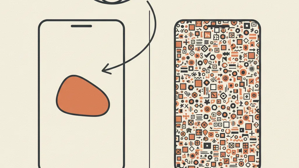
Why minimalism converts: clarity is a cognitive shortcut
Simple doesn't mean cheap. It means the creative has one job to do and does it without distractions. The difference between a creative that works and one that doesn't is almost never about polish — it's about how many decisions it asks the eye to make.
Three principles explain why the essential wins in the feed:
- One visual focus. The eye lands on one point at a time. If a creative has four elements screaming for attention (product, price, badge, testimonial, animated background), none of them actually wins. With a single focus, the message lands in half a second.
- One message. "This product solves X" beats "this product solves X, Y, Z, and it's on sale, and it's sustainable, and shipping is free." Every added benefit dilutes the one before it. A creative that tries to say everything ends up saying nothing.
- Instant readability. The vast majority of traffic is mobile, often with sound off. If the text can't be read without zooming, and the meaning doesn't land without audio, the creative is already dead. Big fonts, high contrast, few words.
There's a reason tests consistently show low-fidelity content ("shot on a phone" photos, raw UGC) outperforming polished productions on CTR during prospecting. Not because raw is magic, but because raw is clear and doesn't look like an ad. Eyes trained to skip ads skip anything that looks like an ad. An overproduced creative screams "I'm about to sell you something" and triggers the defenses.
What changes with Meta's system in 2026
Here's a technical point that flips the old "let's make the creative richer" instinct on its head. With the Andromeda system, Meta shifted delivery logic away from audience interests and toward reading the creative itself. The system uses computer vision to "look at" the ad, recognize its visual pattern, and match it to whoever is most likely to respond.
Meta has stated that creative now accounts for roughly 56% of campaign results, more than targeting, budget, placements, and timing combined. The creative is no longer the ad's outfit: it's the engine. If you want to understand how this changes the strategic playbook, we covered it in what changes with Meta Andromeda for creative.
The counterintuitive consequence: creatives that look different but say the same thing get grouped by the system under a single "Entity ID". Five product photos with slightly different copy can count, in the algorithm's eyes, as a single ad. What matters isn't how elaborate a single creative is: it's whether it carries a genuinely distinct message.
That's why simplicity is a double advantage. An essential creative is easy to read for the person and for the machine. And above all: if each creative does one thing, it's easy to produce variants that say truly different things (problem angle, price angle, social-proof angle, objection angle), instead of twenty versions of the same concept with the glow tweaked. The diversity the algorithm rewards comes precisely from the simplicity of each piece.
The mistake to avoid: confusing "production" with "effectiveness"
Time spent polishing shadows and reflections is not time spent improving the message. They're two different jobs, and the second one matters far more. Creatives that tank performance almost never fail from lack of polish: they fail because the message isn't clear, or because there are too many of them. We collected several in the creative mistakes that sink results.
A practical way to tell if you're overproducing: look at the creative for one second, then cover it. What's left in your head? If you remember the product and one promise, it works. If you remember "it was full of colorful stuff", you have a problem. The one-second test is more reliable than any opinion about "how pretty it is".
Signs a creative is too loaded
- More than one visual focus competing for attention
- Text that can't be read on a phone screen without zooming
- Three or more benefits listed in the same space
- Effects (glow, gradients, animations) that don't help you understand the product
- You need to read everything to grasp the offer, instead of catching it at a glance
How to make simple creatives (and make them fast)
The good news: essential is also faster to produce. You don't need to orchestrate a set, a video, seven layers. You need to decide one thing to say and present it cleanly. Here's a method that holds up under pressure.
- Start from the message, not the graphics. Write in one sentence what the viewer needs to understand. If you can't say it in one line, it's not clear yet, and no graphic design will save it. It helps to think in terms of hooks and opening lines: the hook is what stops the scroll.
- One focus, one clean background. Product large and centered, background that doesn't compete. The rest of the space is there to breathe, not to be filled.
- Few words, big. A short headline (ideally under ten words), readable at a glance. Rule of thumb: if a twelve-year-old wouldn't get it instantly, rewrite it.
- Contrast and color harmony. Text that stands out from the background. Colors in harmony with the product, no off-palette tints that scream "template". Readability comes before aesthetics.
- Vary the message, not just the look. For each product, prepare variants on different angles: the problem it solves, the price, social proof, the main objection. This is where the diversity the system rewards comes from. Finding the angles is harder than finding the template: start with how to find ideas for your creatives.
This is also where AI changes the economics of the game. Producing ten clean variants of a product photo, each with a different angle, used to take an afternoon of design work. With AI creative production you can generate the variants in minutes, keeping the product fixed while changing scene, background, and message. The simplicity of a single piece is exactly what makes production scalable: fewer elements to control, more variants you can churn out.
Want to figure out which angles and how many variants your product needs, and produce them at scale without losing your mind? Request an analysis of your creatives.
Simple doesn't mean "sloppy": the minimum quality bar
Be careful not to grab the wrong excuse. "Simple creatives convert" doesn't mean "crank out anything as long as it's bare". There's a floor below which simplicity turns into carelessness and burns trust:
- The product must be sharp and well lit. A grainy or dark photo isn't "authentic", it's amateurish in the bad sense.
- The text must be error-free and aligned. A typo in the headline destroys credibility faster than a boring background.
- The composition must breathe. Simple means space, not elements thrown in at random.
The healthy rule: strip out everything that doesn't help people understand or want the product, and take great care of the little that's left. Effective minimalism is discipline, not laziness.
How to tell if it's working
Simplicity isn't a leap of faith: it's measured. In the feed, the first indicator is the ability to stop the scroll (thumbstop / hook rate), followed by CTR and, downstream, cost per result. If an essential creative has a high hook rate but converts poorly, the problem is in the offer or the landing page, not the design. If the hook rate is low, the message isn't clear or strong enough.
One useful figure to keep in mind about creative fatigue: the probability of conversion drops by roughly 45% after the same person has seen the ad four times. That's why having many simple, different creatives beats a single perfect one: it gives you ammunition to rotate before the audience gets tired. To read the numbers the right way, we wrote how to tell if a creative is performing.
In summary
Simple creatives don't win because minimalism is trendy. They win because they respect how attention actually works in the feed (less than a second to understand) and how Meta's delivery system works in 2026 (it reads the creative, rewards message diversity, groups duplicates together). One focus, one message, total readability on mobile. Obsessive care for the little that remains. And then plenty of variants on different angles, produced fast, rotated often.
You don't need the richest creative. You need the clearest one, multiplied well.
Frequently asked questions
Do simple creatives really perform better than elaborate ones?
In most cases, yes, especially during prospecting in the feed. A creative with one focus and one message is understood in the half-second a person takes to decide whether to stop. Overproduced creatives often look like ads and trigger the defenses of people scrolling. It's not an absolute rule, but clarity beats richness far more often than people think.
Does simple mean low quality?
No. Simple means one message, one focus, and no distractions — not carelessness. The product still needs to be sharp and well lit, the text free of typos, the composition clean and given room to breathe. Effective minimalism is discipline: strip out everything superfluous and take great care of the little that remains.
How much text should I put in a creative?
The bare minimum needed to carry a message. A short headline, ideally under ten words, readable at a glance on a phone screen. Avoid listing multiple benefits in the same space: every added benefit dilutes the one before it. If the meaning doesn't land silently and in a single glance, there's too much text, or it's too small.
Why does Meta's Andromeda system reward simplicity?
Andromeda reads the creative using computer vision and uses that to match it to the right audience. Creatives that look different but say the same thing get grouped under a single Entity ID and count as one ad. Simple creatives, each with a distinct message, are easy for the machine to read and generate the real diversity the algorithm rewards.
How do I produce simple creatives quickly?
Start from the message, not the graphics: write it in one line. Then a central focus on a clean background, few big words with good contrast, colors in harmony with the product. To multiply variants across different angles (problem, price, social proof, objection), AI cuts the time drastically, keeping the product fixed while changing scene and message.
Is it better to have a few polished creatives or many simple ones?
Many simple, different creatives, generally. The probability of conversion drops by roughly 45% after four exposures to the same creative, so you need ammunition to rotate before the audience gets tired. Meta's system rewards message diversity, not volume of duplicates: six genuinely different angles beat twenty versions of the same concept.
If you want a system that churns out simple, distinct creatives ready to test, let's talk: we'll figure out together how to set it up for your case.