Lead Generation Landing Pages: How to Build One That Actually Generates Qualified Leads
8 min read · AstraLoop Studio
A lead generation landing page has exactly one job: turn a stranger into a contact worth calling back. Not sign them up for a newsletter, not tell them your company's origin story, not get them to download something just for the sake of it. One job.
The problem is that almost every landing page gets judged on opt-in count alone. So the bar drops: shorter forms, generic lead magnets, inflated promises. The result is plenty of contacts, almost all of them junk. Sales calls them, finds out 70% have no budget, no decision-making power, or clicked by accident, and stops trusting whatever leads you hand over.
This article shows you how to build a landing page that does the opposite: it collects fewer contacts, but better ones, and pre-qualifies them automatically the instant the form is submitted, when the person's attention is at its peak. We'll start with the structure, block by block, then close with the integration that changes everything: an AI agent that talks to the lead before you've even opened your CRM.
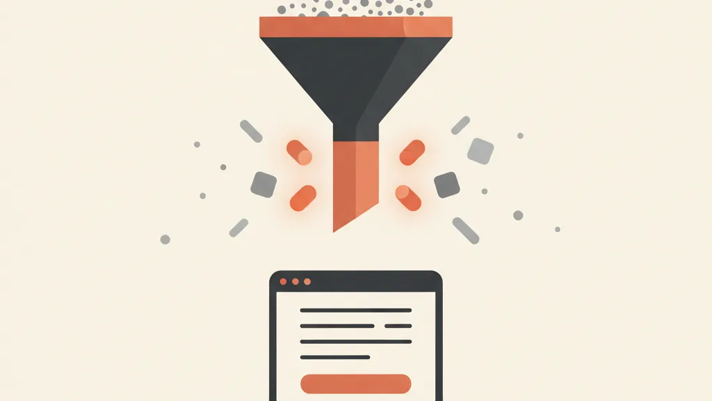
The real goal: qualified leads, not just leads
Before we get to layout, let's be clear on what you're actually optimizing for. If your only KPI is the landing page's conversion rate (visits divided by opt-ins), you're playing the wrong game. A page that converts at 40% but fills your CRM with the curious is worth less than one that converts at 12% but brings in people ready to buy.
The metric that matters sits downstream: how many of those opt-ins turn into qualified leads — contacts with a real problem, a plausible budget, and decision-making power. If you're not clear on what separates a good contact from a useless one, it's worth first reading how you go from MQL to SQL and how lead qualification actually works in practice. Every design choice on the landing page has to serve that filter, not undermine it.
That reframing drives two concrete decisions: how much friction to put in the form (a bit of friction is a filter, not a flaw) and what you offer in exchange for the contact. More on both shortly.
The structure of a landing page that generates leads
A lead generation landing page is not a homepage. No menu, no links leading elsewhere, no escape routes. It's a one-way path toward a single action. Here are the blocks, in order of appearance.
1. Headline: the promise in one line
Visitors decide in three seconds whether to stay or leave. The headline has to say, with no detours, what result they get and for whom. Not "The innovative solution for your growth," which means nothing. Instead: "Get 15 qualified quote requests a month for your solar installation business, with zero cold calling." Specific, measurable, aimed at one precise person.
Below the headline, a subheadline that adds the "how" or removes an objection ("No commitment, free first audit"). Two lines, not a paragraph.
2. The lead magnet: what you give in exchange for the contact
Nobody hands over their data for nothing. The lead magnet is the currency you're trading: a guide, a checklist, a calculator, an audit, a demo, a discount. The golden rule is that it has to be as specific as the customer you want. A generic ebook on "how to do marketing" attracts everyone, meaning nobody useful. A "Calculator: the real cost of a 6 kW solar system in your area" attracts only people who are genuinely weighing the purchase.
The lead magnet does half the qualifying work on its own. If it's well targeted, it filters out the curious before the form even loads. If it's generic, you're stuck filtering them out later, one by one, by hand.
3. Benefits and proof, not features
Right below, three or four blocks that answer the visitor's unspoken question: "what's in it for me?" Don't list features ("dashboard with 40 metrics"), translate them into outcomes ("know in 10 seconds which campaigns are wasting your money"). If you have numbers, show them. If you have real case studies, even better.
This is where proof matters. Reviews with real names attached, client logos, concrete results ("+38% more appointments in 90 days"). Social proof lowers skepticism at exactly the moment the visitor is deciding whether to trust you.
4. The form: where qualification is won or lost
The form is the heart of the landing page, and the point where the quantity-versus-quality trade-off actually plays out. Every extra field lowers submissions but raises the quality of who's left. The right question isn't "how do I get more submissions," it's "which fields get me only the people I actually want to call back."
For B2B lead generation or high-value services, a form with just name and email is a mistake: it fills your CRM with addresses that tell you nothing. Better to use 4-5 fields that include at least one qualifying question: rough budget, timeline ("when would you want to start?"), company size, type of problem. These are the questions sales would ask on the first call anyway. Putting them in the form means you skip that call on the wrong contacts.
5. The CTA: one action, one color, one verb
A single button, repeated if the page is long, always with the same text. Not "Submit" (cold, generic), but the benefit in the first person: "Get my free audit," "Send me the calculation." A color that contrasts with the rest of the page, so the eye finds it without looking. No second button competing for attention.
The mistakes that kill your leads (and how to avoid them)
Landing pages that don't convert, or convert badly, almost always make the same mistakes. Here are the most common ones, all easy to fix.
- Too many exits. Navigation menu, blog links, a footer full of links out. Every link that leads away from the page is a lost opportunity. On a lead generation landing page, the only possible action should be the form.
- Vague headline. If the visitor doesn't know what they get after three seconds, they leave. No poetic slogans — a concrete promise.
- Generic lead magnet. It attracts everyone, meaning nobody useful. The more specific it is, the better it filters.
- Form too long or too short. Too long scares people off, too short doesn't qualify anyone. The right length depends on the value of your offer: the more valuable your service, the more fields you can get away with.
- No proof. Promises without reviews, numbers, or real case studies sound like everyone else's, and skepticism wins.
- Silence after submission. The lead fills out the form, gets a "thanks" and then nothing for two days. This is where most warm leads are lost. And this is exactly where automation comes in.
If you want a broader list of the typical missteps upstream of the landing page itself, we've put together the lead generation mistakes to avoid in a dedicated article.
The missing link: pre-qualifying the lead right after opt-in
Here's the part almost nobody handles well, and it's what separates a decent landing page from a real acquisition system. A lead's peak attention isn't when they get your reply email the next day. It's the exact second they click "submit." In that moment they're engaged, they've just declared interest, the problem is fresh in their mind. Ten minutes later they're back at work. A day later they've gone cold.
The classic landing page wastes that moment: it shows a "thanks, we'll be in touch" and hands everything off to sales, who will call whenever they get to it — maybe hours or days later. Meanwhile the lead has already filled out three of your competitors' forms.
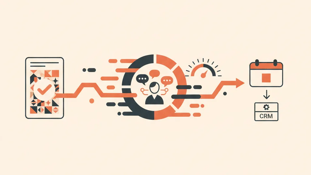
The version we recommend to our clients closes that gap with a conversational AI agent that engages the lead the instant they opt in. As soon as the form is submitted, the contact is greeted by a conversation (on the page, via WhatsApp, or by phone call) that does three things at once.
- Deepens the qualification. The questions that would have been too many for the form, the agent asks naturally, one at a time, the way a good setter would: budget, urgency, context, objections.
- Assigns a score. Based on the answers, the lead gets classified and lands in the CRM already labeled: hot, warm, or discard. The valuable ones go straight to the top of sales' list; the rest don't waste their time.
- Books or routes. If the lead is ready, the agent offers a calendar slot directly. Sales wakes up to an appointment already booked, not a list of cold numbers to dial.
The practical result: your team only talks to contacts that are already screened and already warmed up, and it happens while the lead is still hot, not 48 hours later. It's the same principle behind an AI agent that qualifies leads on WhatsApp, applied to the moment right after opt-in. And it connects the landing page to the rest of the system: the page collects, the agent filters, the CRM integrated with the funnel keeps everything in one traceable place.
Is your landing page collecting contacts that just sit there waiting for someone to call them back? Tell us how your acquisition works today: we'll show you where the hot leads are slipping away and how to pre-qualify them automatically right after opt-in.
How to measure whether your landing page actually works
A lead generation landing page needs to be measured on two levels, not one. The first is obvious. The second is the one almost everyone forgets.
| Metric | What it tells you | Rough benchmark |
|---|---|---|
| Conversion rate (opt-in) | How many visitors fill out the form | 10-25% (warm or targeted traffic) |
| Cost per lead | How much each contact you collect costs you | Depends on channel and industry |
| % of leads that are qualified | How many opt-ins are actually worth something | The goal is to raise this, not the first metric |
| Cost per qualified lead | How much a contact sales would actually call back costs | The metric that really matters |
Watch out for the most common reflex: pushing up the conversion rate at any cost. Shorten the form, inflate the promise, and the landing page numbers improve. But if the percentage of qualified leads then collapses, you've made the business worse and a slide better. Always look at the downstream number. To understand how to think about lead costs without getting fooled by surface-level numbers, take a look at our guide on cost per lead.
Test, don't guess
No landing page is born perfect. The best ones are the result of successive tests: different headlines, different lead magnets, longer or shorter forms, different CTA copy. The rule is to test one thing at a time, so you know what actually moved the result. And give each test enough traffic before deciding, or you're reading noise, not a signal.
The landing page is one piece, not the whole system
Let's clear up a common misconception. A landing page doesn't "do" lead generation on its own. It's the collection point of a bigger system: there's the traffic that feeds it (ads, SEO, email), there's the landing page that converts, there's the agent that qualifies, there's the CRM that stores, and there's sales that closes. If even one of these links is weak, the whole flow leaks.
Many companies build a beautiful landing page and then drop it at the end of a poorly calibrated lead generation funnel, or with no downstream process to manage the contacts at all. It's like installing a gold faucet on a leaking pipe. The landing page needs to be designed as part of the flow, not as a standalone object. If you want the full picture, from first visit to qualified contact, our pillar piece on copywriting for customer acquisition lays out every piece in order.
In short: build the landing page for the lead you actually want (not for the highest opt-in number), put a qualifying field in the form, and above all don't leave the contact in silence after they submit. That first minute after the click is the hottest moment you'll ever have with that person. Use it to pre-qualify them, not to make them wait.
Frequently asked questions
What's the difference between a landing page and a regular website page?
A landing page has exactly one goal and no escape routes: no menu, no external links, only one possible action, usually filling out a form. A website page, like a homepage, offers many paths and is built for browsing. For lead generation you need the first kind, because every link leading elsewhere is a potential lost contact.
How many fields should a lead generation landing page form have?
It depends on the value of your offer. For a lightweight lead magnet, name and email are enough. For high-value or B2B services, it's better to ask for 4-5 fields, including at least one qualifying question (budget, timeline, company size). A bit of friction filters out the curious and gets you only contacts worth calling back.
What conversion rate should a lead generation landing page have?
With targeted, warm traffic, a reasonable range is 10% to 25% of opt-ins. But that's not the number to watch: it's the percentage of those contacts that turns into a qualified lead. A landing page that converts less but brings in contacts ready to buy is worth more than one that converts a lot and fills your CRM with the curious.
What is a lead magnet and why do you need one?
It's what you offer in exchange for the contact: a guide, a checklist, a calculator, a free audit, a demo, a discount. It matters because nobody hands over their data for nothing. The more specific the lead magnet is to the customer you want, the more it filters out the curious before the form even loads, doing half the qualifying work on its own.
How do you pre-qualify a lead right after opt-in?
A lead's peak attention is the instant they submit the form, not the next day. A conversational AI agent (on the page, on WhatsApp, or by phone) can engage them right away, ask qualifying questions naturally, assign a score, and offer a calendar slot directly. That way sales only talks to contacts that are already screened and still warm.
Is a landing page enough on its own to generate leads?
No. The landing page is the collection point of a system: traffic that feeds it, a form that converts, an agent that qualifies, a CRM that stores, and sales that closes. If even one link is weak, the whole flow leaks. The landing page needs to be designed as part of the funnel, not as a standalone piece.
If you want a landing page that brings in qualified contacts, not just emails, with an AI agent that warms them up the exact moment they hand over their details, talk to us: we design the full flow, from the page to the CRM.