Copy and Creative: How Text and Visuals Work Together in Ads
8 min read · AstraLoop Studio
Most ads that don't work don't have a copy problem or a visual problem. They have a coordination problem between the two. The text says one thing, the image says another, and the person scrolling stops for half a second, doesn't understand what you're offering, and moves on. Or, an even more common case, the copy and the visual say the exact same thing: the headline repeats what's already visible in the image, and half the ad space goes to waste.
Copy and creative aren't two separate jobs glued together at the end. They're two tools that need to tell the same message from two different angles, each doing what it does best: the visual stops the scroll and communicates at a glance, the copy clarifies, adds the promise, and drives action. This article gets into how to actually make them work together: starting from the shared angle, through message hierarchy, all the way to consistency between what you read and what you see.

First things first: there's one angle, not two
The root cause of almost every uncoordinated ad is thinking "first I'll make the graphic, then I'll write something on top of it." Do that and the visual is born from one idea and the copy from another, and the result is a collage. The correct order is the opposite: decide the angle first, then have both copy and visual serve it.
The angle is the single lever the ad rests on. It's not the product, it's the reason it should matter to the person looking at it. The same pair of shoes can be sold with completely different angles:
- Problem/solution angle: "Sore feet after 8 hours on your feet? These have an insole built for people who work all day."
- Status/identity angle: "The shoes that turn heads when you walk into a room."
- Price/value angle: "The same quality as a €200 brand, for €79."
- Novelty angle: "The style that sold out in 48 hours, back in stock."
Each of these angles calls for a different visual and a different copy. With the "problem/solution" angle the visual might show a close-up of the foot, the insole detail, a real work scene. With the "status" angle it would show the shoe in an aspirational setting, curated lighting, styling. If you pick the "status" visual but write "problem/solution" copy, you're fighting yourself.
So the practical starting point is just one thing: decide the angle before opening any design editor. If you want a structured method for generating angles instead of relying on in-the-moment inspiration, we cover this in how to find creative ideas for ads and in the creative process framework. And behind the angle there's almost always a customer awareness level to respect: talking about an "ergonomic insole" to someone who doesn't even know they have a problem is wasted effort. On this, the five levels of customer awareness is the map to keep in front of you.
Message hierarchy: who says what, and in what order
Once the angle is decided, the next question is: which part of the message do you hand to the visual, and which to the copy? Not everything should be written, and not everything should be shown. There's a reading hierarchy, and it needs to be designed.
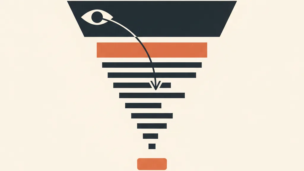
The way the eye consumes an ad in the feed is brutally fast and always the same:
- The visual (0-0.5 seconds): it's the first thing that stops the scroll, or doesn't. There's no reading here, only seeing. The visual's job is to earn the next second.
- The text inside the creative (the overlaid headline, if there is one): the first piece of language. It has to be readable at a glance, few words, the benefit or the hook.
- The first line of copy (the "primary text," the part that isn't cut off by "...more"): the explicit promise, the expansion of the angle.
- The rest of the copy: only read by people already hooked. This is where proof, details, and handled objections go.
- The CTA: the action, explicit and low-friction.
The golden rule of hierarchy is: every level must add something, not repeat it. If the image clearly shows a leather bag, the headline shouldn't say "leather bag." That's throwing away the opportunity. It should say something the eye alone couldn't have known: "Pick it up tomorrow" (speed), "Handmade in Tuscany" (origin), "Only 7 left" (scarcity). The visual has already communicated the "what"; the copy needs to communicate the "why now" and the "why you."
A simple way to check the hierarchy before publishing: cover the text and look only at the image. Can you tell what category of product it is? Good. Then cover the image and read only the copy. Does the message still hold up? If so, you have two elements that support each other. If reading the copy without seeing the image tells you nothing, the copy is too dependent on the visual (or vice versa). The two need to be complementary, not one propping up the other.
A concrete repetition test
Take your last ad and lay out in a column what the visual says and what the text says:
| Element | What it communicates (bad, repetitive) | What it should communicate (good, complementary) |
|---|---|---|
| Visual | Face cream in a white jar | Face cream, creamy texture, glowing skin up close |
| Headline in creative | "Moisturizing face cream" | "Absorbs in 30 seconds, zero greasy feel" |
| First line of copy | "Our face cream moisturizes skin" | "Tested on 400 people with sensitive skin: 9 out of 10 repurchase" |
| CTA | "Learn more" | "Try it for 30 days, refund if you're not convinced" |
In the right column, every element adds a new piece of persuasion. In the left column, "moisturizing face cream" is said three times in different words. The performance difference isn't marginal, it's the difference between an ad that works and one that burns budget.
Consistency: same world, same tone, same promise
Consistency is the third leg. An ad can have the right angle and a clean hierarchy and still fall apart if copy and visual live in two different worlds. Consistency plays out on three levels.
1. Tone consistency
If the visual is clean, minimal, with plenty of white space and a premium aesthetic, copy that shouts with emojis and "RUN AND BUY NOW!!!" clashes and cheapens the perceived value. Conversely, if the creative is fun, colorful, a bit ironic, cold and corporate copy kills it. The tone of the text needs to live in the same emotional world as the image. This matters even more when there's a brand behind it with a defined voice: the creative is one of the places where that voice either shows or gets betrayed.
2. Promise consistency (the deal you make with whoever clicks)
This is the most expensive one to break. If the creative promises "50% off" and the landing page shows full price, you've burned the click and the money it cost you. If the visual shows the product in one variant and whoever lands on the site finds something completely different, bounce rate spikes. Consistency here isn't about aesthetics, it's about substance: what the ad promises has to be there, identical, after the click. It's the continuity between the creative and the destination that carries the whole conversion. If that bridge breaks, even the best ad becomes a hole in the budget, and to find out where it breaks you need the right signals for reading a creative's performance.
3. Internal visual consistency (color, text, product)
Even inside a single creative, text and image need to harmonize. The color of the overlaid text should dialogue with the product's palette, not fight it: an electric-purple block on a pastel-toned product is a jarring signal of "slapped-together graphics." Text should sit in readable zones, with enough contrast, without covering the part of the product doing the actual selling work. These are details, but they're exactly the details that separate a professional ad from a rushed one, and they're often the silent cause of mistakes that kill performance.
Want to produce creatives where copy and visual actually work together, at scale? Tell us about your case: let's look together at how to set up a consistent, scalable creative production system.
How to write copy that strengthens the creative (instead of repeating it)
Now for the practical core. Once you understand that copy and visual need to be complementary, how do you actually write text that adds something? Here are the moves that work.
- Let the visual say the "what," let the copy say the "so what?". The image shows the product. The copy answers the question the viewer instinctively asks: "okay, and what does this change for me?" Benefit, transformation, result.
- Use the copy to handle the objection the visual can't handle. An image can't say "yes, but shipping is free" or "yes, and if you don't like it you can return it." Copy can. Get ahead of the "but…" that stops the purchase.
- Hook the reader in the first line, don't introduce yourself. The first line of the primary text shouldn't say "We at [company] are leaders in our industry." It needs to step into the angle: a stinging question, a surprising stat, a line that whoever has that problem recognizes as their own. You'll find good techniques for this in hooks for ad creatives and in persuasive copywriting techniques.
- One idea per ad. If you're testing the "price" angle, don't also throw in "artisanal quality" and "fast delivery." You dilute the message and lose track of what actually worked. One angle, one ad. The other angles become other creatives to test.
- Write the CTA as a continuation of the promise, not as a generic button. "Learn more" is noise. "Find your size in 10 seconds" or "See the reviews before you decide" lower friction because they say exactly what happens after the click.
One principle sums it all up: copy doesn't describe the creative, it completes it. If you're writing something the viewer can already infer from the image, delete it and write the missing piece instead.
Copywriting frameworks that pair well with creative
You don't need to reinvent the wheel every time. Proven structures like AIDA, PAS (Problem-Agitation-Solution), and BAB (Before-After-Bridge) give the text a skeleton that fits naturally with the visual hierarchy. With PAS, for example, the visual can embody the "problem" (a frustrating scene) while the copy carries the agitation and the solution. We've laid out these structures in the AIDA, PAS, and BAB copywriting frameworks, useful exactly for aligning text and image instead of writing them at two disconnected moments.
Producing consistent copy+visual pairs at scale
The problem, when you're not producing three ads but thirty, is repeated consistency. Testing many angles means producing many copy+visual pairs, and each one has to follow the three rules: a single angle, a clean hierarchy, consistency. Done by hand, one at a time, it becomes the bottleneck that stalls all your testing.
This is where automating creative production changes the game. The idea isn't "have AI write the ads and hope for the best," but to build a system where the angle is decided upstream and both the text and the visual are generated from that same angle, guaranteeing by construction that they speak the same language. A well-built AI creative production workflow produces consistent variants in batches, each with copy and visual aligned on the same concept, so you can test ten in the time it used to take you to make one. It's the same principle behind the automated creative generation systems we build: consistency stops depending on one person's discipline and becomes a property of the process.
This ties into a bigger theme: as creative becomes the real performance lever (more than targeting, in an advertising ecosystem increasingly driven by AI), the ability to churn out many consistent variants and test them quickly becomes a competitive advantage. Creative production stops being one-off craftsmanship and becomes an engine. If you want the full picture, from angle to measurement, the complete guide to ad creative puts all the pieces together.
Checklist before you publish
Before sending any copy+visual pair to a live campaign, run these five checks:
- Angle: can I state in one sentence what this ad's single lever is? Do both copy and visual serve it?
- Non-repetition: cover the visual, does the copy hold up? Cover the copy, does the visual make sense on its own? If the copy repeats what the image already shows, rewrite the missing piece.
- Hierarchy: the visual stops the scroll, the headline hooks in a few words, the first line expands the promise, the CTA closes it. Every level adds something.
- Tone and color consistency: does the text sound like the emotional world of the image? Does the text color dialogue with the product's palette?
- Promise consistency: does what the ad says match, identically, what's on the landing page after the click?
These are five thirty-second questions that eliminate most weak ads before they burn budget. The difference between people who get results from ads and people who complain that "advertising doesn't work" is almost always here: making text and visual work as one thing, not as two jobs stapled together.
Frequently asked questions
What's the difference between copy and creative in an ad?
The creative is the visual part: image, video, graphic, overlaid text. The copy is the written text of the ad: headline, primary text, CTA. They aren't two separate jobs but two tools that need to tell the same angle, each doing what it does best: the visual stops the scroll, the copy clarifies, promises, and drives action.
Should the copy describe what's already visible in the image?
No, that's the most common mistake. If the image already clearly shows the product, the copy shouldn't repeat it: that wastes half the ad space. The visual communicates the "what," the copy needs to add the "why now" and the "why you": benefit, proof, objection handling, urgency. Practical rule: if you're writing something already obvious from the image, delete it and write the missing piece instead.
What is an ad's angle?
The angle is the single lever the ad rests on: not the product itself, but the reason it should matter to the viewer. The same product can be sold with different angles (problem/solution, status, price/value, novelty). The angle needs to be decided before creating the graphic and the text, because both need to serve it: deciding it afterward produces uncoordinated ads.
How do I tell if copy and visual are consistent?
Check three levels. Tone: does the text sound like the emotional world of the image (loud copy clashes with a minimal, premium visual)? Promise: does what the ad says match, identically, what's on the landing page after the click? Internal visual consistency: does the text color dialogue with the product's palette and avoid covering the part that's selling? If any of these is missing, the ad loses power even with a good angle.
What's the right order: design the graphic first, or write the copy first?
Before either comes the angle. Once the angle is decided, copy and visual are designed together so they both serve it the same way, not one after the other as disconnected elements. The mistake to avoid is "first I'll make the graphic, then I'll write something on top of it": that way the two are born from different ideas and the result is a collage.
How do I produce many consistent copy+visual pairs when I need to test many angles?
The bottleneck is repeated consistency: every variant has to follow a single angle, a clean hierarchy, and consistency. An AI-automated creative production system, where the angle is decided upstream and both text and visual are generated from that same angle, guarantees by construction that they speak the same language and produces many aligned variants in batches, so you can test more in the same amount of time.
If your ads are spending without converting, the problem is often the coordination between text and image. Request an analysis: we'll find where it breaks and how to fix it.