Marketing Dashboards in Looker Studio: Turning Data into Decisions
7 min read · AstraLoop Studio
End of the month. You ask yourself a simple question: "did marketing pay off this month?" To answer it, you open GA4, then Google Ads, then Meta's Business Manager, then the CRM, and just to be safe, an Excel sheet too. Every screen gives you a different conversion number. After half an hour of overlapping tabs, you have more doubts than when you started.
It's the daily routine for a lot of Italian SMBs, and it's not your fault: marketing data is born scattered, each source with its own counting logic. Looker Studio (formerly Google Data Studio) is Google's free tool that connects these sources into a single view that updates on its own. But be careful: a dashboard is only useful if it changes what you do on Monday morning. Most dashboards look nice and nobody looks at them. Here's how to build one that unites GA4, Ads and your CRM so you can see the real ROI at a glance, and decide.

What Looker Studio is (and isn't)
Looker Studio is Google's free data visualization tool, renamed in 2022 (it used to be called Data Studio). It connects to dozens of sources, builds interactive reports, and you share them with a simple link: whoever opens it always sees fresh data, without you emailing screenshots around.
What it is not — and this is the point that ruins 90% of dashboards — is a tracking system or a database. It doesn't "collect" data, it reads it from wherever it already lives. If the tracking upstream is broken or missing, the dashboard will show you wrong numbers, just faster and with nicer charts. Before the dashboard always comes properly built conversion tracking: it's the foundation everything else rests on.
Compared to tools like Power BI, Looker Studio is the lightweight, marketing-oriented layer. For an SMB it easily covers what's needed, with no licenses and no dedicated consultants.
Why one dashboard (and why platform ROAS lies)
The problem isn't a lack of data, it's too many versions of the truth. Google Ads tells you 40 conversions, Meta claims 35, GA4 counts 30, and the CRM logs 22 customers who actually paid. It's not an error: every platform counts its own conversions with its own attribution window and takes credit whenever it can. Add them up and you get more conversions than actually happened.
There's worse: the ROAS you read inside Google and Meta is self-reported and generous. It knows nothing about returns, refunds, real margin, or leads that will never close. In lead generation it's even more misleading: the platform counts the "lead," but if seven out of ten contacts are junk, that ROAS means nothing. The real, collected revenue lives in the CRM.
That's exactly what a dashboard that matters does: it pairs cost (from the ad platforms) with real revenue (from the CRM). It's the shift from platform ROAS to thinking in MER instead, and it forces you to confront the limits of attribution models instead of trusting the first colorful number you see.
The sources to connect (and which ones give you trouble)
A serious ROI dashboard draws from four families of data. Two are easy, two less so.
- GA4: native, built-in connector. It gives you on-site behavior, conversions, and traffic sources. If you haven't set it up properly yet, start with how to configure GA4 from scratch.
- Google Ads: native connector. Spend, clicks, impressions and conversions by campaign, ready to pull in.
- Meta Ads: here's where the first snag hits. Google doesn't offer a free native connector for Facebook and Instagram. You need a partner connector (Supermetrics, Windsor.ai, Coupler.io, Porter and similar, almost all paid) or a periodic export into Google Sheets.
- CRM: the piece that makes the difference, and the most laborious one, because it's where the real revenue lives. Three routes: export to Google Sheets (simple, automatable), BigQuery (robust, for larger volumes), or a dedicated connector. If your CRM is already built around your own processes, exposing this data is much easier.
Google Sheets and BigQuery, in this setup, act as the glue: they collect whatever doesn't have a direct connector and feed it to Looker Studio in an orderly way.
The real challenge: making the sources talk to each other
Connecting the sources isn't enough: by default they stay separate islands. Meta's spend and the CRM's revenue don't merge on their own. Looker Studio has a data-joining feature ("blending") that combines them on a shared key.
The key is usually date plus campaign, or UTMs. And here's where the second snag hits: if your UTMs are a mess (utm_source sometimes "facebook," sometimes "FB," sometimes blank), the blend won't match anything, and the numbers you get look precise but are made up. Having your UTMs set up with discipline isn't a nerdy detail: it's the condition for the dashboard to tell the truth.
There's one last step that often gets skipped: to link a CRM sale back to the campaign that generated it, the source information has to enter the CRM at the moment of the lead (via UTM or click ID). It's the same mechanism you need to feed offline conversions from the CRM back to the platforms. Without this link, the "revenue by campaign" column will always stay empty.
Want a dashboard that actually tells you whether marketing is paying off, without cross-checking ten tabs by hand? Tell us how your data is set up and we'll show you how to connect it.
How to build the dashboard, step by step
The visual part is the quickest bit. Here's the method that works.
- Start from the decisions, not the charts. Write down the 5-7 questions the dashboard needs to answer: how much did I spend in total? How many customers (not leads) did I get? What's the CAC per channel? Is overall ROI positive? Which campaign is burning budget? If a chart doesn't serve one of these decisions, it doesn't make the cut. It helps to start from the KPIs that actually matter and ignore vanity metrics.
- Connect the sources. First the native ones (GA4, Google Ads), then Meta and the CRM via a partner connector or Google Sheets.
- Structure the page as a pyramid. At the top, scorecards with the 5-6 key figures (spend, leads, customers, revenue, CAC, ROI): the at-a-glance view. Below that, spend versus revenue trended over time. Then the breakdown by channel (Google, Meta, organic). At the bottom, a per-campaign table with cost, conversions, revenue and ROI row by row.
- Do the blending between cost (platforms) and revenue (CRM) on the date-plus-campaign key.
- Add filters for date range and channel, so anyone who opens the report can query it without asking you anything.
- Share the link with the decision-makers and set up automatic refresh. From here on, the dashboard runs itself.
The mistakes that make a dashboard useless
- Too many metrics. Thirty charts on one page equal zero decisions. Less is always better.
- No real revenue from the CRM. If you stop at platform ROAS, you're just decorating an inflated number.
- Obsessing over real-time. Almost no marketing decision gets made minute by minute. A daily or weekly refresh is more than enough.
- Blending on keys that don't match. Messy UTMs produce tables that look precise and are actually false.
- No owner. A dashboard with no one responsible and no ritual (a Monday review, say) is a dashboard nobody looks at.
The dashboard is the tool, not the finish line
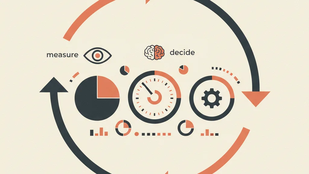
The point of all this isn't to have a nice-looking control panel, but to close a loop. You track cleanly, you see the real ROI, you decide (you shift budget from the campaign that's losing to the one that's paying off), the CRM feeds real conversions back to the platforms, and their algorithms start optimizing on real customers instead of junk leads again. The dashboard is the gauge that tells you whether the loop is turning the right way.
For most SMBs the bottleneck isn't "which chart do I pick," it's "the data doesn't arrive clean and connected in the right place." That's exactly the connective work between tracking, CRM and automation that lets a dashboard tell you the truth, instead of being a collection of pretty, unreliable numbers. Built this way, you stop guessing and start deciding.
Frequently asked questions
Is Looker Studio really free?
Yes, Looker Studio is free. You only pay for third-party services, such as partner connectors for Meta Ads or for sources not covered by Google's native connectors, and for BigQuery if you use it as a data warehouse.
What's the difference between Looker Studio and Google Analytics?
GA4 collects and stores your site's traffic and conversion data. Looker Studio doesn't collect anything: it reads data from GA4 (and other sources) and turns it into visual, shareable reports. One measures, the other displays.
Can I connect Meta Ads to Looker Studio?
Not with a free native Google connector. You need a paid partner connector (Supermetrics, Windsor.ai, Coupler.io and similar) or a periodic export of Meta data into Google Sheets, which you then connect to Looker Studio.
How do I connect my CRM to see real revenue?
The three most common routes are: exporting CRM data to Google Sheets (the simplest way), using BigQuery for large volumes, or a dedicated connector. The real requirement is that the lead source (UTM or click ID) is saved in the CRM, otherwise you can't attribute revenue back to the campaign.
How long does it take to build an ROI dashboard?
A first useful version, with native GA4 and Google Ads, can be up and running in half a day. Most of the time goes into integrating Meta and especially the CRM, and cleaning up UTMs: depending on the state of your data, that can take anywhere from a few days to a couple of weeks.
Looker Studio or Power BI?
For a marketing-focused SMB, Looker Studio is free, integrates natively with the Google ecosystem, and is more than enough in most cases. Power BI makes sense if you're already on the Microsoft ecosystem, need complex data modeling, or handle very large upstream volumes.
If your numbers are scattered across GA4, Ads and a CRM that doesn't talk to anyone, request an analysis: we'll clean up your tracking and build the dashboard you need.