Lead Generation Landing Pages: How to Build One That Converts
8 min read · AstraLoop Studio
A lead generation landing page has exactly one job: turn a visitor into a contact. It doesn't need to look pretty, win design awards, or tell the story of your company. It needs to convert. Full stop.
And yet most landing pages we see do the exact opposite. Navigation menus everywhere, headlines that talk about the company instead of the customer, forms that ask a total stranger for their tax ID. Every element out of place costs you real leads — with a first and last name attached.
In this guide I'll show you how to build a page that actually converts: the section-by-section structure, how to write headlines and forms, where to place social proof, the mistakes that are draining your funnel, and the tests that move the needle. If you want to see how this page fits into the bigger picture, start with our complete guide to B2B lead generation.

What a lead generation landing page (really) is
A landing page is a single page, isolated from the rest of the site, built around one single conversion goal. For lead generation, that goal is collecting a contact: an email, a phone number, a quote request, a booked call.
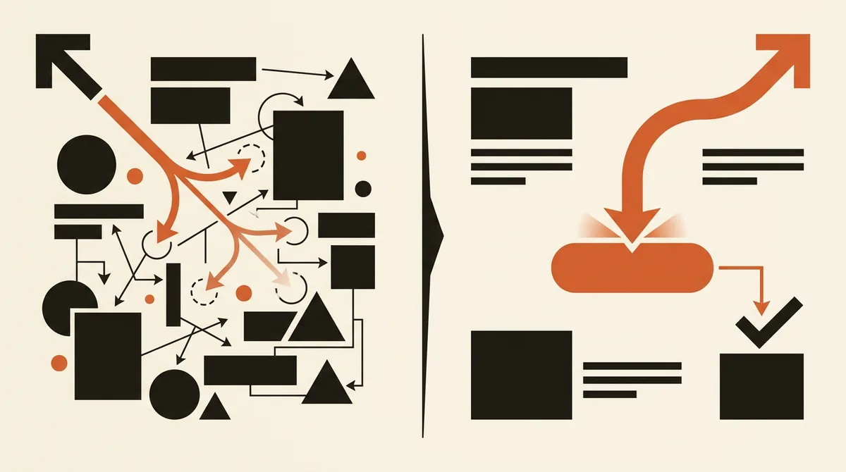
The difference from a normal site page is brutal. The homepage wants you to explore. The landing page wants you to take one single action. Every extra link, every distraction, every "check this out too" is an emergency exit the visitor will use to leave without giving you anything.
Let's also be clear on what a landing page isn't: it isn't the finish line. It's the start. The lead you collect here enters a wider journey, as we explain in our piece on the lead generation funnel. If you collect contacts and then let them die in a spreadsheet, even the best landing page in the world won't save you.
The structure of a converting landing page, block by block
There's no magic layout, but there is a hierarchy that works almost every time. The idea is to walk the visitor through a logical path: promise, context, proof, action. Here's the order we use.
- Hero: a benefit-driven headline, a subheadline that clarifies it, a single visible CTA, and a micro proof element (a number, a logo, a star rating).
- Problem: 3-5 lines describing your customer's real situation. They should think "this is talking about me".
- Solution and benefits: 3-5 concrete, observable outcomes — not empty adjectives.
- Social proof: testimonials, logos, numbers, case studies. This is where trust gets built.
- How it works: the process in 3-4 steps, so the visitor knows what happens after the click.
- Objections: a mini FAQ that answers the doubts blocking the decision.
- Final CTA and form: the last call to action, consistent with the first.
On a long page, the CTA should repeat. Don't force someone who's already convinced to scroll all the way down to convert.
The headline: 90% of the game is won here
The headline is the first thing people read, and often the only thing. It needs to communicate a concrete benefit tied to the visitor's problem, not be creative for creativity's sake.
Compare these two examples. "Welcome to our website" says nothing. "Get 10 qualified quotes a month without chasing clients" says everything: what you get, how much, and how it changes your life. The second one always wins.
Practical rule: if you cover the headline and the page becomes incomprehensible, you've done a good job. If the headline could sit unchanged on a competitor's site, rewrite it.
The form: ask only for what you need right now
Every form field costs you conversion rate. Name and email are almost always enough to start a conversation. Tax ID, company revenue, and full address — ask for those later, once the contact is warm.
There's a balance to strike. A too-short form brings in plenty of leads, but often poorly qualified ones. A richer form filters people out and gets you contacts that are more ready to buy. The choice comes down to what you'd rather manage: volume or quality. If your problem is getting contacts that never close, read how to qualify leads before you lengthen your form at random.
One tip that moves the numbers: add a line of reassurance under the button. "No spam, we're the only ones who'll write to you" removes one of the most subtle points of friction — the fear of being bombarded.
The CTA: promise, not effort
The button copy matters more than you'd think. "Submit" and "Request" communicate effort. "Get your guide" and "Book your free consultation" communicate the reward.
Shift the focus to the benefit, use first person when you can ("I want my quotes"), and make the button impossible to miss: contrasting color, generous white space around it, generous size. One primary CTA per page. Put three different ones on there and the visitor picks none of them.
Social proof: why a stranger should trust you
The visitor doesn't know you. Social proof is what closes that trust gap in a matter of seconds. Here's what works, in order of strength.
- Concrete numbers: "370K+ qualified leads generated" or "60+ companies served" say more than a thousand adjectives. At AstraLoop, these are ours, and they're the first thing we show.
- Specific testimonials: not "great service", but "we doubled our quote requests in three months". The detail is what makes it credible.
- Client logos: if you've worked with recognizable brands, show them.
- Measurable results: an average 210% growth for clients carries more weight than any promise.
Social proof should be spread out, not clustered in one spot. A number in the hero, a testimonial near the benefits, logos before the final CTA. Walk the visitor along as their trust builds.
Is your landing page getting visits but few contacts? Let's talk: AstraLoop analyzes your page and shows you exactly where you're losing leads. Write to us at astraloopstudio@gmail.com.
The common mistakes draining your funnel
We see so many landing pages sabotaged by avoidable mistakes. These are the most frequent, and the most costly.
- Self-referential headline: you talk about yourself instead of the customer's problem. They don't care who you are, they care what you solve.
- Active navigation menu: every link is an exit door. On a landing page, the menu should be removed or reduced to the bare minimum.
- Form that's too long: asking a cold contact for eight pieces of data is the fastest way to make them leave.
- Generic, hidden CTA: a grey "Submit" at the bottom of the page doesn't convert.
- Inflated promises: if you promise the impossible, the visitor senses it and stops trusting you. Real social proof beats hyperbole.
- Slow mobile landing page: most of your traffic comes from smartphones. If the page takes five seconds to load, you've already lost half your contacts before they even see the headline.
Notice the common thread: almost every mistake comes from putting the company at the center instead of the customer. Flip the perspective and half the problems disappear.
Where the traffic comes from changes everything
A landing page doesn't exist in isolation. The visitor arrives from somewhere, and the source's message has to match the page's message. If your ad promises a "free guide" and the landing page talks about a "product demo", trust collapses — and your conversion rate with it.
This alignment between ad and landing page (message match) is one of the most underrated levers there is. Anyone running lead generation with Facebook and Instagram Ads or with Google Ads should build a dedicated landing page for each campaign, not send everyone to the same generic page.
There's also a cost angle. A landing page converting at 3% instead of 1% makes you pay a third as much per contact. If you want to know what a lead should cost you, take a look at cost per lead by industry in our deep dive on CPL. The landing page is the cheapest multiplier you have: optimizing it doesn't cost you media spend, it saves you money.
Testing: the only way to really know what converts
Nobody nails the perfect landing page on the first try. Not even us. The difference between businesses that grow and businesses that stagnate is that the former test systematically.
The rules for doing A/B testing right are few, but strict.
- One element at a time: change only the headline, or only the CTA, or only the form length. Move everything at once and you'll never know what actually worked.
- Start with what matters: headline and CTA move the numbers far more than the button's exact shade of blue. Start there.
- Wait for enough data: a winner after twenty visits isn't a winner, it's noise. Let the test run until the data holds up.
- Look beyond the click: use heatmaps to see where eyes stop, where people scroll, where they abandon the form.
Watch out for one misleading metric: lead count isn't the finish line. If you collect lots of contacts who never buy, you've optimized for the wrong thing. The real indicator is how many of those leads become qualified leads and then customers. A landing page that brings in a few good contacts beats one that brings in many useless ones.
The landing page is one piece, not the whole system
You can have the most polished landing page on the market, but if the lead you collect isn't contacted quickly, qualified, and followed up on, all you've done is fill a database. The page is the first gear of a much bigger machine.
This is the difference between assembling a page and building an acquisition system. At AstraLoop we combine AI and automation with lead generation: the landing page captures the contact, an automated flow qualifies and routes it, and no lead is ever left waiting. That's how 60+ companies have generated over 370K qualified leads with us.
If you want your landing page to stop being a showcase and become a contact-generating machine, the fastest way is to work with someone who connects it to the rest of the system. Find out how an AI-powered lead generation agency works, and turn your visitors into customers.
Frequently asked questions
How many fields should a lead generation landing page form have?
As few as possible to start a conversation: name and email are almost always enough. Every extra field lowers your conversion rate. Ask for additional data once the contact is already warm. If you need more qualified leads, you can add one or two filter fields, trading some volume for more quality.
What's a good conversion rate for a landing page?
It depends on your industry and traffic source, but a well-built landing page often converts between 5% and 15% of qualified traffic. Below 2%, there's almost always a problem with the headline, the form, or the match between the ad and the page. Rather than chasing an absolute number, measure improvement over time through constant testing.
Do I need a different landing page for every ad campaign?
Yes, whenever you can. The ad's message needs to match the landing page's message. Sending traffic from different campaigns to the same generic page lowers conversion because it breaks that consistency. A dedicated landing page for each offer or audience converts far better.
Is a form or a call-booking button better?
It depends on the value of the offer and the audience. For cold contacts and simple offers, a short form works better. For high-value services or more informed audiences, booking a call filters people and brings in contacts who are more ready to buy. It's often worth testing both options.
Is a landing page enough to generate customers?
No. The landing page collects the contact, but the customer comes after: fast qualification, follow-up, nurturing. Without a system that follows up on the lead, even the best landing page just produces an unused database. The page is the first step of a funnel, not the finish line.
Want a landing page that actually converts and feeds an automated acquisition system? Contact AstraLoop and let's build it together, from the first click to the customer.